
Prev Page
View All Tutorials
See Why More First Dates at eharmony Become Happy Relationships !
Lets Add A Button To our App named- Tutorials
You can add a button with text; you can add a button with an image as its background; or you can add image and text to a button.In this tutorial, we will code each of these into our apps layout file; using the Button, and ImageButton elements.
You can also refer to the Android Developers website for additional reading on buttons.
From Android Developers website
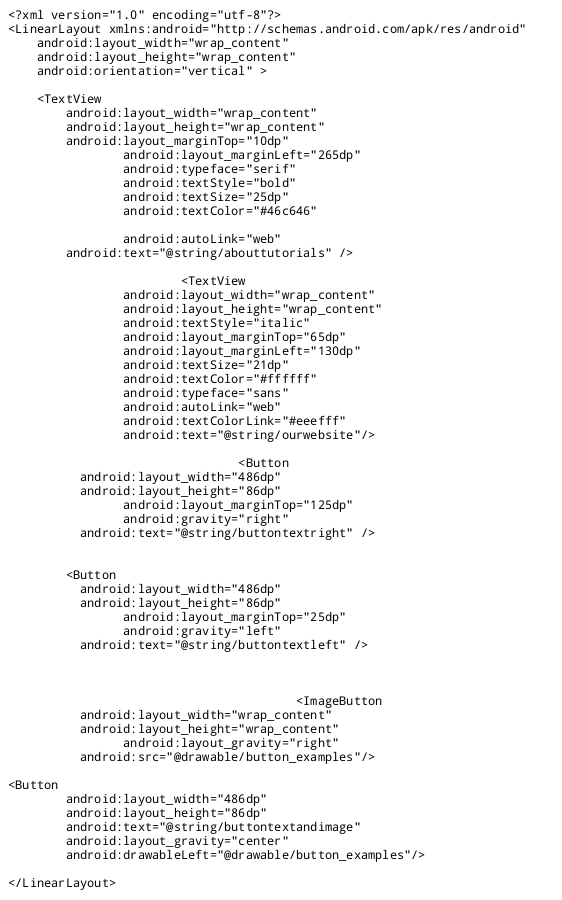
....how to code a button - android app
Our app Named: Tutorials
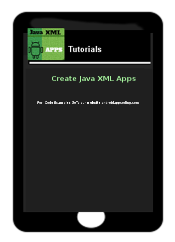
If you are reading and coding from each of our tutorials; then your app
should now look like this one shown in this image.
If you are just arriving at this page; you can
gohere to first create your simple app
Lets edit this first page of our app (the app's first Activity layout); we are going to:
add a button with text placed to the right
add a button with text placed to the left
add a button with an image as its background
add a button with an image for its background and with some text
Adding a Basic Button with Text
We have added 4 buttons to our apps firstpage which is coded in our app's View layout file at res/layout/main.xml
This is the file where you code all your Textviews for your app; and things like text, buttons, images, menus, also are coded in this file.
If your app had 2 pages, it could be named main2.xml, and any text, buttons, images would be coded in the same manner as your first page - main.xml.
Our App named Tutorials
Once you edit your code to add the buttons, your app should look like this app image.
Looking at the tablet screen view image of these buttons...
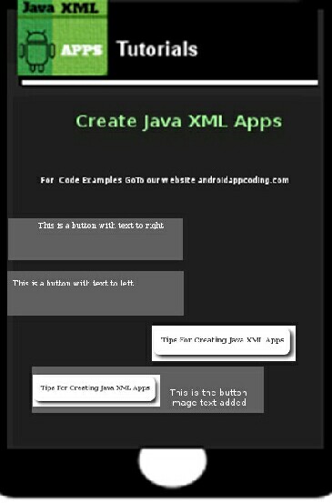
...you can see they are all different.
The first button has text placed in it on the right side of the button.
The second button has text placed in it on the left side of the button.
The third button has an image as its background, no text.
The last button has the same image, and some text was added also.
Lets look at the coding for each button we added:
The Button element is used for creating the basic button. In this first button's code; we placed the text to the right side of the button using the android:gravity-"right" attribute.

If we want to determine where to place the text within the button, we use android:gravity; and we can place text where ever we want: common choices being right, center, or left.
For all attributes available: Browse Android Developers
Attributes for android:gravity
Button Text
Next, we added text to the button: to do so we must create a string for the text, as shown is this next image; name it whatever you like; and code it into our strings.xml file .Since we added text to 3 of the buttons, we create 3 separate strings, 1 for each button's text.
And, as we already know: (from our strings tutorial) all strings are placed in the strings.xml file, located at:
res/values/strings.xml
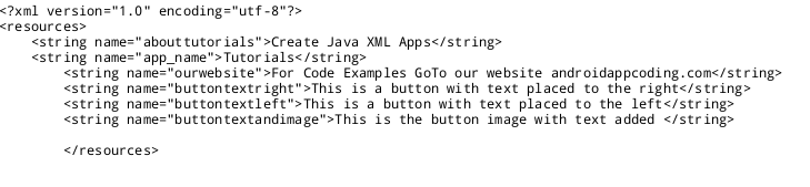
Your strings are coded in the strings.xml file, and; a reference to it must be coded into the Button element in your layout file as shown here in the first image.
android:text = "@string/stringname"

Margins
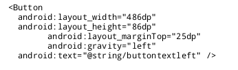
This first button has a margin added to allow for spacing between the previous element and this button. Looking at the Tablet Screen View image; you can see the spacing allowed from the line of text to where the button is placed.
This is done using the android:layout_marginTop = "125dp" code. By default the android system places
the buttons with some spacing between them; but you can also customize the spacing using additional code attributes and values
as shown.
For all margin_layout attributes; browse Android Developers
Margin Layout Parameters
Width and Height
For this button we also defined its width and height; using the android:layout_width="486dp" and android:layout_height="86dp" attributes.For all android width and height layout attributes; browse, android:layout_width and android:layout:height
You can make your buttons any size you like using these coding attributes and their value. The dp means density pixel; this is usually used as it is most appropriate to the screen density pixels of tablets and more easily scalable to different screen sizes. Most commonly used are dp(density pixel) and px(pixel).
You can read about other attributes as well from Android Developer website:
The second button has its text placed to the left in the button.
This is done using the same attribute as the
first button, however, we use the value 'left' android:gravity="left" and, we made this button the same size as the first button.
The third button has an image as its background, so it is coded differently than the first two buttons. When you
want to add an image as the button background you use the ImageButton element, instead of the Button element.

To add the image we use this code:
android:src="@drawable/button_examples
@drawable means its an image, and as we know from our drawables tutorial; all images are placed in the
res/drawable folder. The image we used is named button_examples.png. You can download the button to add to your
drawables folder from our Code Examples on this page.
Just right click to save it to your tablet; then copy/paste it to the
AppProjects/tutorials/res/drawable/
drawable-hdpi folder
You code it as button_examples, you don't need to include the .png as you can see looking at this
image of the coding.
This button image has been placed on the right side of the screen view.
To do this,
we added the
android:layout_gravity="right"; attribute;
as shown in this image of the code. Common choices are right, left, center; for all available
attributes browse to Developers Android
Attributes for android:layout_gravity
For the android:layout_with and android:layout_height coding of this image button; we used the wrap_content attribute. This means that
the button will wrap around and match the image's size.
The fourth button we added is the same width and height as our first two buttons; having used the android:layout_width and android:layout_height attributes to
define its dimensions. And, since we added text also to this image button; the button size has allowed for the text being added.
We wanted to center this button in the Screen View; so we used the android:gravity="center", code.
To add text to the button: we coded
android:text="@string/buttontextandimage
and, to add our image and place it left on the button; we coded:
android:drawableLeft="@drawable/button_examples
Other common attribute values are: drawableRight, drawableCenter.
The Button element was used, not the ImageButton element; because we added an image and text. If you are just
adding an image No Text - then you can use the ImageButton element.
Here is the image view of all code changes we have made to this app named - "Tutorials"
Having made our changes: We will now RUN, INSTALL, OPEN our app to update the app files:
(To RUN your app, click the top right icon in AIDE, the choose RUN. Follow prompts to install, and update the app.)
Then, simply open the app to view it.
This is the code for all edits we have done to our app named Tutorials, including this button tutorial; so you can just copy and paste to replace the code you now have on your res/layout/main.xml page;
and copy - replace the res/values/strings.xml file code also,
save each page, then RUN your code, INSTALL OPEN the app, to see the Buttons we added in this tutorial.
This free script provided by
JavaScript
Kit
AIDE for creating Android Apps on your tablet or cell phone(android).
Free and Paid.
GoTo Aide
ANDROID STUDIO - for creating Android Apps on your desktop computer.
Free to Install and Use
GoTo Android Studio Learn more - Android Studio
The Java XML files we code(example codes) and the Android Apps we create in our Free Tutorials are compatible with Android Studio and AIDE. Just choose Java XML as your Programming Language.
You May Like:
Make Sushi Rolls at Home Taste World Wines Flavours and Aromas